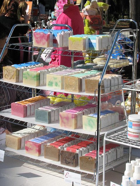
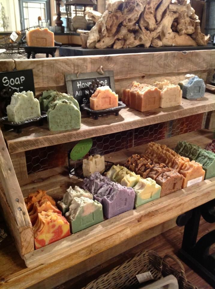
I agree, the first one is too sterile-looking as-is, with the chrome shelves. Those are the shoe-racks like you can get at home-depot. They come in white also.
I can envision this becoming much more inviting by using the white ones, same as the smaller shelves next to them, and using fabric to cover the "shelf" part of the rack, maybe with ribbon accents, rather than the white plastic shelf-liner they're using.
I like how it lets the soaps be displayed easily, and from the colors, the finished look of the soaps, and the cards and labels they used, it looks like they're going for a look that's more elegant or less rustic or something, but it needs some "hand-made" touches to achieve elegant-but-not-sterile.
