I like Obsidians version as well. Just enough color to grab your attention.
You are using an out of date browser. It may not display this or other websites correctly.
You should upgrade or use an alternative browser.
You should upgrade or use an alternative browser.
Yes, another "How's my label?" thread
- Thread starter grumpy_owl
- Start date

Help Support Soapmaking Forum:
This site may earn a commission from merchant affiliate
links, including eBay, Amazon, and others.
Dahila
Well-Known Member
I get this picture........hepataitis
I love black and white, very much so..
I love black and white, very much so..
Momsta5
Well-Known Member
I really like it! It is simple but makes an impact. The font is nice. I would only adjust the size of the owl so that there is less of a void in the circle or drop it down a bit?
I really like it! The yellow eyes are nice but colour printing can be a pain if you weren't intending on going that way to start with.
If you wanted to square it up visually without altering your circle, you could go in this direction (you could use the black for the soap name depending on your font, but you'd probably have to make it thicker).


If you wanted to square it up visually without altering your circle, you could go in this direction (you could use the black for the soap name depending on your font, but you'd probably have to make it thicker).


Dorymae
Well-Known Member
Stacy I really like what you did there! Now I really like the one with the yellow. Amazing how a little tweak can change everything.
- Joined
- Sep 23, 2010
- Messages
- 15,094
- Reaction score
- 6,770
I'd go with the yellow (with back outline), I was drawn to that one first. The black and white looks to stark for me.

$35.74 ($0.32 / Ounce)
Nature's Oil Coconut 76 Degree, Naturally Refined, 7lbs (1 Gallon)
Bulk Apothecary

$25.02 ($0.31 / Ounce)
$32.00 ($0.40 / Ounce)
Primal Elements Triple Butter Soap Base (Mango, Shea, and Cocoa Butter) - Moisturizing Melt and Pour Glycerin Soap Base for Crafting and Soap Making, Vegan, Cruelty Free, Easy to Cut - 5 Pound
Amazon.com

$8.62
$14.99
The Natural Soap Making Book for Beginners: Do-It-Yourself Soaps Using All-Natural Herbs, Spices, and Essential Oils
Amazon.com
$25.99 ($0.32 / Ounce)
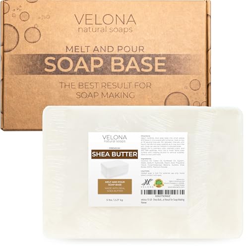
velona 5 LB - Shea Butter - Melt and Pour Soap Base SLS/SLES free | Natural Bars for The Best Result for Soap-Making
Velona

$37.95 ($0.34 / Ounce)
COCONUT 76 Oil. Soap making supplies. 7 pound Gallon.
Traverse Bay Bath And Body

$6.74 ($0.48 / Fl Oz)
La Tourangelle, Organic Coconut Oil, Refined, For Cooking, Baking, Hair, and Skin Care, Expeller Pressed, 14 fl oz
Amazon.com

$16.95 ($4.24 / Fl Oz)
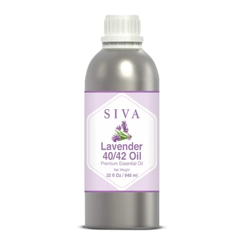
Pure Body Naturals French Lavender Essential Oil Blend, 4 fl oz - for Aromatherapy, Soap Making, and DIY Skin and Hair Products
Pure Body Naturals®

$11.99 ($3.00 / Fl Oz)
Ethereal Nature 100% Pure! Peppermint Oil – Perfect For Aromatherapy Diffusers, Skin, Nail and Hair Care – Beauty DIY – 4 FL OZ
Amazon.com
$7.99
$9.99
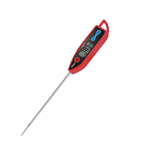
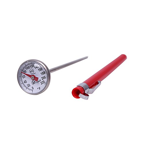
KT THERMO Instant Read 1-Inch Dial Thermometer,Best for The Coffee Drinks,Chocolate Milk Foam
BestPartners

$7.99 ($2.00 / Fl Oz)
$9.99 ($2.50 / Fl Oz)
SilkySecret Peppermint Essential Oil (4 Fl Oz), Mint Oil for Hair Care, Skin Massage, Aromatherapy and Sprays, Relieves Muscle Pain, Refreshes
Saahow

$24.96 ($0.31 / Ounce)
$32.00 ($0.40 / Ounce)
Primal Elements White Soap Base - Moisturizing Melt and Pour Glycerin Soap Base for Crafting and Soap Making, Vegan, Cruelty Free, Easy to Cut, Unscented - 5 Pound
Amazon.com
grumpy_owl
Well-Known Member
- Joined
- Aug 3, 2014
- Messages
- 342
- Reaction score
- 414
Wow, that is super cute, Stacy! You are all so talented and helpful.
The bit of yellow in the eyes is what I pictured when it was first mentioned. I love it (the one that Stacy did). Nice options, hard choice.
Wildcraft_Garden
Well-Known Member
I like the yellow too!
Putting on my printer's hat.... how are you going to be printing your labels? At home? At a print shop?
Keep in mind that there can be a substantial difference in the price of printing just black on white and printing in colour.
I love the logo, btw. However, I'm in the minority in liking the b/w version better that the one with colour.
Keep in mind that there can be a substantial difference in the price of printing just black on white and printing in colour.
I love the logo, btw. However, I'm in the minority in liking the b/w version better that the one with colour.
- Joined
- Jan 10, 2014
- Messages
- 3,294
- Reaction score
- 1,609
I know this doesn't really relate but I saw this cute owl picture and thought of your logo...
https://www.etsy.com/shop/DoodleBliss
Sorry - here's the artwork
https://www.etsy.com/listing/253216911/owls-original-art-11x17-inches-pen
https://www.etsy.com/shop/DoodleBliss
Sorry - here's the artwork
https://www.etsy.com/listing/253216911/owls-original-art-11x17-inches-pen
Similar threads
- Replies
- 3
- Views
- 1K
- Replies
- 79
- Views
- 4K
- Replies
- 108
- Views
- 3K


