I love your label. Very clean and clear. A bit of color will just add that extra something needed.
You are using an out of date browser. It may not display this or other websites correctly.
You should upgrade or use an alternative browser.
You should upgrade or use an alternative browser.
Yes, another "How's my label?" thread
- Thread starter grumpy_owl
- Start date

Help Support Soapmaking Forum:
This site may earn a commission from merchant affiliate
links, including eBay, Amazon, and others.
dixiedragon
Well-Known Member
Are you soaps round? Are you printing your own labels, or will someone else?
I think the design is nice and sharp, but it doesn't seem soapy to me?
I think the design is nice and sharp, but it doesn't seem soapy to me?
kchaystack
Supporting Member
Sorry, zolveria--what is "foiled"?
If it is what I think as foil printing, it means the printing has a metallic sheen.
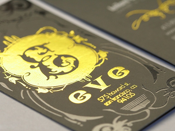
If you are printing it and have a laser printer there are products that you can buy to do it yourself, if you also have a laminating machine.
My first thought looking at the round logo was that it would look perfect on a vertical label, like on a box kind of packaging, with yellow owl eyes yes. But a vertical theme may not work well if your soaps have high tops and such.
grumpy_owl
Well-Known Member
- Joined
- Aug 3, 2014
- Messages
- 342
- Reaction score
- 414
All righty, here is the yellow version. Perhaps too yellow? Also the non-soapiness of it might be an issue, although I like that it's strong and clear and not full of bubbles and fairies. I appreciate bubbles and fairies, just not my aesthetic. I wanted to be more unisex and vintagey.
And the foil looks awesome! I might experiment with it but will probably end up going too far down the fussy rabbit hole, as I have a tendency to do.
Anyhoodles, here's what she gave me.

And the foil looks awesome! I might experiment with it but will probably end up going too far down the fussy rabbit hole, as I have a tendency to do.
Anyhoodles, here's what she gave me.

I was thinking the foil might work *on* the yellow/gold for the eyes. I am not sure (not the best w/colors) but I think something a little darker/more contrasting, like a gold foil, might work better. It almost seems like the foil would look like a gold mica against the black, in soaping terms 
The non-soapiness is not an issue for me at all. I kind of prefer non-soapy logos, they are more interesting and less generic to me, and it sometimes makes me think (in a good, curious way) about the company itself. Which I think is better w/hand-made soap, people are spending the extra money in part b/c they *want* something non-generic (or at least I did before I made my own.)
ETA: Also, my preferred aesthetic is a bit hipster/vintage, but that works in a lot of SoCal areas, which is where you will be selling, right? I think part of this does depend on your local market, unless you plan on doing a lot of on-line sales.
Last edited:

$15.93 ($0.55 / Fl Oz)
$16.99 ($0.59 / Fl Oz)
Nutiva Organic Coconut Oil with Non-Dairy Butter Flavor, 29 Fl. Oz. USDA Organic, Non-GMO, Whole 30 Approved, Vegan & Gluten-Free, Plant-Based Replacement for Butter
Amazon.com

$18.89 ($1.18 / Ounce)
Extra Virgin Coconut Oil Cold Pressed Carrier Oil for Essential Oils Mixing & Soap Making Supplies
Soapeauty

$119.74 ($0.21 / Ounce)
Nature's Oil Coconut 76 Degree, Naturally Refined, 35lbs (5 Gallon)
Bulk Apothecary

$7.95 ($0.57 / Fl Oz)
Nutiva Organic Coconut Oil with Butter Flavor from non-GMO, Steam Refined, Sustainably Farmed Coconuts, 14-ounce
iHerb LLC

$37.95 ($0.34 / Ounce)
COCONUT 76 Oil. Soap making supplies. 7 pound Gallon.
Traverse Bay Bath And Body

$19.08 ($0.24 / Ounce)
$29.05 ($0.36 / Ounce)
Primal Elements Clear Soap Base - Moisturizing Melt and Pour Glycerin Soap Base for Crafting and Soap Making, Vegan, Cruelty Free, Easy to Cut, Unscented - 5 Pound
Amazon.com

$23.50 ($0.29 / Ounce)
$32.00 ($0.40 / Ounce)
Primal Elements Triple Butter Soap Base (Mango, Shea, and Cocoa Butter) - Moisturizing Melt and Pour Glycerin Soap Base for Crafting and Soap Making, Vegan, Cruelty Free, Easy to Cut - 5 Pound
Amazon.com

$8.62
$17.99
The Natural Soap Making Book for Beginners: Do-It-Yourself Soaps Using All-Natural Herbs, Spices, and Essential Oils
Amazon.com

$69.97
$79.99
Illumive Deluxe Soap Making Kit - Large Soap Making Kit. Includes All Soap Making Supplies. DIY Soap Making Kit.
Novarbee

$16.95 ($4.24 / Fl Oz)
Pure Body Naturals French Lavender Essential Oil Blend, 4 fl oz - for Aromatherapy, Soap Making, and DIY Skin and Hair Products
Pure Body Naturals®
dixiedragon
Well-Known Member
If you do yellow eyes, the actual eye should be yellow, not the eye brows.
How affordable is the foil? It's a cool sounding idea - but you might be paying a LOT for something that's not that much more dramatic than a yellow ink eye.
How affordable is the foil? It's a cool sounding idea - but you might be paying a LOT for something that's not that much more dramatic than a yellow ink eye.
grumpy_owl
Well-Known Member
- Joined
- Aug 3, 2014
- Messages
- 342
- Reaction score
- 414
Yeah, it looks like the owl is trying to hypnotize you. The yellow should only be in the middle, anyway. I think I'll stick with the black and white.
This is more of what I was thinking:

Can you see my picture?
Can you see my picture?
Last edited:
TVivian
Well-Known Member
Yeah, it looks like the owl is trying to hypnotize you. The yellow should only be in the middle, anyway. I think I'll stick with the black and white.
I like it with just B&W too.
I don't like the solid yellow eyes either, something like this looks better.


Last edited:
I like that, Obsidian. Def. better than the first color addition, and maybe better than the B/W (I am kind of torn there.)
Lol, obsidian, yours looks just like mine that I posted but I'm not sure anyone can see it but me for some reason...
Deedles
Well-Known Member
I love the logo but totally agree with Obsidian's version. The yellow eyes really pop whereas the version from the graphic artist just looks like she forgot to outline the eyes.
- Joined
- Jan 14, 2014
- Messages
- 4,131
- Reaction score
- 4,275
I like Obsidian's version better - just enough yellow to draw you in. (Although, I think the owl looks a little less grumpy - not a bad thing!) :smile:
Spenny, your labels are perfect: Easy to read so instantly I can read the type of soap, then my eyes are quickly drawn to your bar....which gives me the rest of the "story". In a single moment I know exactly what that bar of soap is!
Spenny, your labels are perfect: Easy to read so instantly I can read the type of soap, then my eyes are quickly drawn to your bar....which gives me the rest of the "story". In a single moment I know exactly what that bar of soap is!
spenny92
Well-Known Member
- Joined
- Jun 20, 2015
- Messages
- 256
- Reaction score
- 161
I like Obsidian's version better - just enough yellow to draw you in. (Although, I think the owl looks a little less grumpy - not a bad thing!) :smile:
Spenny, your labels are perfect: Easy to read so instantly I can read the type of soap, then my eyes are quickly drawn to your bar....which gives me the rest of the "story". In a single moment I know exactly what that bar of soap is!
Ah, that's so sweet - thank you. I really wanted to keep them simple, so that's lovely to hear.
OP, I definitely prefer the black and white logo. I think it's great just the way it is, and I'm really looking forward to seeing your completed labels!
Dorymae
Well-Known Member
I like the logo in B&W. If it were me I would eliminate the outer circle. For my own designs it would open up the logo a little.
I like Obsidian's version too . . . it's exactly what I pictured when yellow eyes were mentioned and the black outline really makes it pop
- Joined
- Jan 10, 2014
- Messages
- 3,294
- Reaction score
- 1,611
I like Obsidian's version too . . . it's exactly what I pictured when yellow eyes were mentioned and the black outline really makes it pop
Agreed. That's exactly what I pictured as well. Very nice look.
Similar threads
- Replies
- 3
- Views
- 1K
- Replies
- 79
- Views
- 5K
- Replies
- 158
- Views
- 7K
- Replies
- 179
- Views
- 6K


