My new label

Soapmaking Forum

Help Support Soapmaking Forum:

This site may earn a commission from merchant affiliate links, including eBay, Amazon, and others.
Joined
Sep 26, 2008
Messages
692
Reaction score
245
Location
TN
We make our own lard as well as goats milk and cow milk. We also grow our own herbs.
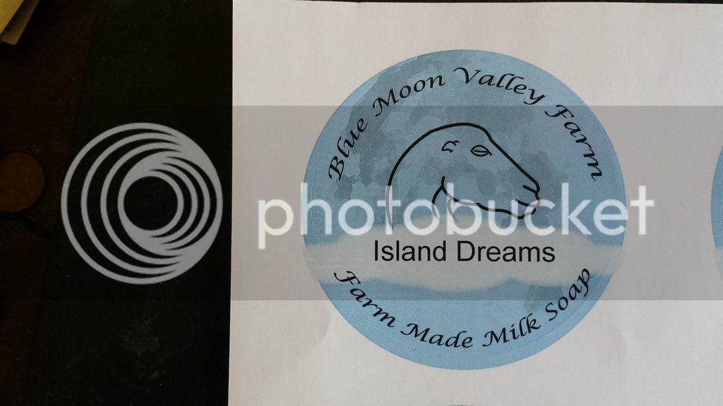
20150604_125748.jpg
 
I love how the round label really looks like a blue moon with the darker spots. And I like the fonts you chose as well as the way you used a lighter color to highlight the name of the soap. It really looks like looking up at the night sky and watching a cloud float over the face of the moon.

Do you need the size of the bar on the front label?
 
Just change the shape of goat neck, please :) It does look strange to me. I realized that you trying to make the same head as is on your avatar....
 
I'm sorry, I have to agree with Dahlia. I really like everything about the label.....except the drawing of the goat. It doesn't look like a goat. I'm not sure what it looks like....but not a goat.
 
I'm not crazy about the goat drawing, either. The shape/curve of the neck, and the eyes. . .are the eyes supposed to be closed? It looks like the goat is sleeping or (I'm promise I'm not trying to be offensive here) is no longer alive.

I don't love pictures of goats on labels in general, though. I'm sure it's just me, but my first thought is that the soap is made of goat fat rather than goat milk. I'm not against using animal fats, I just don't want to see a picture of a pig on a lard soap, for example.

I do like the clean, simple look of the label, though.
 
I like the clean simple look of your label but have to agree on the neck of the goat. I looks more like a serpent to me. Awesome idea though. Maybe a bit of tweaking.
 
I get that there are different goats, and a person who raises them may be perfectly fine with the drawing. Those of us who do not (probably your customers) would see that as odd. I did grow up in NY though. :) My wife, who grew up on a farm and thinks there's NOTHING cuter than a baby goat, thinks it's fine.
 
The head is based on ADGA logo. It is also more art Neoveau style. We are in horse country here. It is a La Mancha head art styled. Straight neck did not work on round label.
 
Loch Ness monster it is what I see:)) logo needs more work to put in and is going to be just awesome. Yes , goats are the cutest things alive just after dogs and horses:))

I didn't want to say it, but that's what I see too. It may be recognizable among people who know goats, but for your customers, I think it may be a bit off putting. I think goats, especially babies, are adorable. If you're trying to appeal to customers, I don't think that's the picture to do it. I'm sorry, and again, among people who know goats, the picture may seem perfectly fine, but if you're looking for an honest critique from someone who would see this as a customer.....the picture is a little creepy...the neck, the tiny ear, the eye. When I look at it, I keep wanting to figure out what it is, instead of thinking, "Oh, a goat....that's goat's milk soap." It's such a stunning label otherwise.
 
Loch Ness monster it is what I see:)) logo needs more work to put in and is going to be just awesome. Yes , goats are the cutest things alive just after dogs and horses:))

Exactly what I thought: Nessie! But overall, I like the label, just not the best drawing of a goat. Goats. I "love me some" goats. I miss my goats.
 
As a goat person (Nigerian Dwarfs), I can see where you kept the curvy look of the logo, and what you wanted to do, but I think your target consumers won't have any idea why the image is the way it is. If you want to keep the curved look, I think you may have to lessen the curve of the neck to look a bit more natural. I like the look of the label, but I also think it looks like Nessie right now.
ETA- misspeak
 
I really like the Blue Moon in the back ground along with the cloud so you can read the fragrance easily.

I dont think anyone here is trying to be mean about the goat.

When I saw it, for some reason my original reaction was to be sad. When I looked closer I noticed that the goat looks like it is sleeping.

That was a good thought because it matches that dreamy/sleepy theme with the moon. However, sleeping animals seem like they are hard to convey in a line drawing. Instead of them looking "cute" or endearing they end up evoking a feeling of sadness becuause they look like they are not alive. Maybe you can add more detail to the drawing to give the goat a little more "life". I know that will no longer be in art neuvo style though
 
One thing that I would mention is we are in farm country here. No real big cities close by. Many folks know these goats real well as well as the other breeds. FFA and4H is very active in our state not to mention county and town. I will have pictures with story up of our goats and animals and how we raise them. Many goat farmers here do not make and sell soap as they are dairies that sell commercial milk for the stores. The few that do have there markets in other areas. I tested this label local and it was really well received by everyone. kids loved it as well as parents. Goats eyes are slitted pupil not round like dogs. Did not notice the sleep look but it works. Label goes on round soap so it is round itself. Dairy goats do have a long neck and show goats do curve maybe not that much but it is OK. I have been thinking adding a smaller one faceing in other direction but first batch is printed so will stay for this first 200. Thanks for the thoughts. :D
 
If it is received well in your target market then I think that's all that matters! I think its great that the kids liked it! That's always a good sign. I'm glad you had a lot of good support for it. I think with your story and customer area, it will be a good label choice then!
 

Latest posts

Back
Top