Your First Thought on My Logo

Soapmaking Forum

Help Support Soapmaking Forum:

This site may earn a commission from merchant affiliate links, including eBay, Amazon, and others.

tbeck3579

Well-Known Member
Joined
Apr 23, 2015
Messages
178
Reaction score
76
Location
Central IL
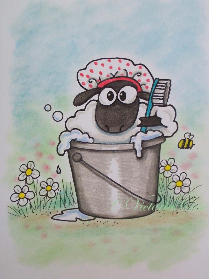
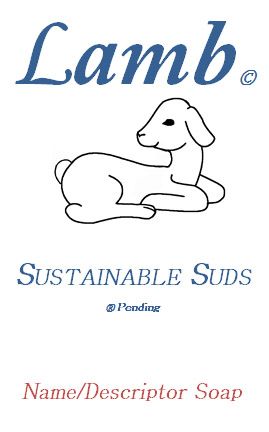
What do you think? Don't hold back :thumbdown: I won't be offended, well I don't think so??? Hahaha.

A%20Lamb%20Logo_zpszsjkmlmi.jpg
http://www.soapmakingforum.com//www.pinterest.com/pin/create/extension/
 
Last edited:
Same. Although you might want to get rid of the "Name/Descriptor" part and leave the "Soap" part by itself.
 
First impression was baby products. It is very cute, but if you are going for goats milk soap geared to adults the logo didn't hit me that way. It is a picture I would expect on baby products.
 
Patrick, I assume the "Name/Descriptor" part will be filled in by the frangrance/type, eg "Lavendar Buttermilk" or whatever, so the label needs it. Could be wrong, though.

Teresa, I'm afraid that I agree with Dory, it does suggest a baby/children's soap, maybe because of the lamb pic. It also suggests mildness/naturalness/simplicity generally - and maybe people will take it that way - but it might be interesting to try some changes now and see how they are received (heck, get some opinions from those donees you are giving soap to at the food pantry/church, get them to work!)
 
Last edited:
I am going to third the baby soap impression. I also don't get the tie between "Lamb" and soap unless you are milking sheep. If Lamb is your last name, I would go with something like, "Lamb's Luxurious Soaps" or "Lamb's Sustainable Suds", then perhaps just the face of a lamb in the top left corner next to the word 'Lamb's'.
 
In all honesty, I dislike it. I wouldn't buy a product with that logo. To me, it looks dated and, as above posters have mentioned, child-like. It may be a personal thing, but I really dislike the fonts used and the picture of the lamb.

I had my logo designed by someone else, as I'm hopeless at interpreting the ideas in my head onto paper (well, screen). It was very cheap and better than anything I could have done myself. Are there any logos out there that you like the look of? It might be nice to see your inspiration, or a description of what you want your logo to say/mean.
 
Yes I agree with above, is better to have done by professional, if the money is an issue ask a student of fine art to make one for you. This does not look like logo. I had seen it and did not want to hurt your feelings so kept quiet. Logo is something that everyone will remember , look apple , everyone knows what it is, the bitten off apple........Your logo must be clean, neat and not clattered and easy to remember.
 
Last edited:
If you use goat milk, then 'kid' soap is what should be on there.

As for the label, you need to work out what is important - is the company name 'lamb' or 'sustainable suds' or a mix of the two?

For logos, labels and marketing in general, think about why people will buy your soap. What is it about your soap that makes it worth them buying? Who are your target customers and why? Hippy people looking for 'all natural'? Bubbly teens looking for bold FOs and bright colours? Then think of things that will appeal to them
 
Actually, Teresa, I love the name "Sustainable Suds", I like the dual meaning (ie; environmental message and the notion that the bubbles hang in there!)

It must be hard to balance packaging which represents who you are w/whom your market is. So I guess if it were my logo I would try to figure out that balance, ie; mostly for you/donations (that would be the case for me, so I probably wouldn't care that much about what other people thought) or mostly/exclusively for sale, in which case some of the answers might take time to figure out.

Eg, is/will your market be mostly local - in which case I'd want the label to appeal to the types that are the most frequent buyers in your particular areas/outlets - or on-line, in which I'd try to make it as wide-reaching/sort of attractively and eye-catchingly generic as possible within limits. Ugh, I can see it is not fun to design a label, unless you are crazy like cenz and IL :)

I don't like Lush, but they certainly can sell the crap out of soap ....
 
I want to give a like to each person that posted, but if I remember correctly I only have a certain number of "likes" I can use each day and I'm afraid if I run out I'll offend someone. I appreciate the candid response from everyone. I also recognize that if I wanted a consumers opinion of soap the group here would be very biased -- we can't help it, we know too much about soap.

First, please fill in the blank: Dove _______________. 9 out of 10 of you probably said soap. When I see a Dove I personally think of bird crap because the dog gone Mourning Doves on the farm leave me big piles Everywhere they roost.

I'm sort of giggling to myself because...

1. I needed a logo only for the sale of soap at the church fall craft fair.
2. All the "Christian" symbols I looked at really didn't convey what I wanted: this is soap for people who want "pure" ingredients and it IS "gentle" to the skin. Remember, I live in a rural area and "lye" soap is sometimes conceived as harsh, very bad for the skin, and not very gentle. Most people do not make soap and most people are marketed "Beauty Bars" by the mass media, so most people are biased.
3. The lamb with the cross on it seemed a little too, well, specific to the Church.
4. I took my own advice and looked at "big business"; the multi-billion dollar corporate logos. I looked at the top 10 richest companies logo's. Think "Apple" and you don't think of computers; Steve would disagree with you. Think "Windows" and you don't think of software; Bill would disagree with you. Very simple pictures that have nothing to do with technology.
5. Now think about the best selling soap ever: DOVE.

Now, the giggling part -- remember Dove is the best selling soap ever marketed to the American public and they have made more money than any other soap company. Compare the photo below to mine (same type of font, color and arrangement) and keep in mind multi-billion corporations appeal to your micro-second decision making process (knee jerk reactions of the human mind). A consumer will either look at a product or not, and if they don't look your product you don't get a sale. Industrial Psychology is a science and they are PAID big money to influence your buying decisions. You may not think your decisions are influenced, but I guarantee mass media has told you what to think, when to think it, and you think it hundreds of times a day. Okay, the pics:

logo-Dove-Converted.jpg
http://www.soapmakingforum.com//www.pinterest.com/pin/create/extension/
 
Last edited:
I don't care much for it either, sheep doesn't make me think of soap, purity or children. It makes me think of smelly animals, I grew up with sheep and there is nothing pure about them. I do quite like the name and think a pile of suds with or without a bar of soap would convey a better message.

If you had millions of dollars to advertise your product then you could make anything work, as you pointed out with dove and apple. We know what they are because both are advertised non stop, literally shoved in our faces daily.
 
5. Now think about the best selling soap ever: DOVE.

Now, the giggling part -- remember Dove is the best selling soap ever marketed to the American public and they have made more money than any other soap company. Compare the photo below to mine (same type of font, color and arrangement) and keep in mind multi-billion corporations appeal to your micro-second decision making process (knee jerk reactions of the human mind). A consumer will either look at a product or not, and if they don't look your product you don't get a sale. Industrial Psychology is a science and they are PAID big money to influence your buying decisions. You may not think your decisions are influenced, but I guarantee mass media has told you what to think, when to think it, and you think it hundreds of times a day. Okay, the pics:

I think the issue with trying to "match" an already existing brand is that they dont need an eye catching logo anymore. They are already established in the market and at the time of their initial logo design descisions, that may have been a good name. If "Dove" was just getting started as a company now, I can pretty much guarentee that they would not choose a logo like that.

I agree that I think the lamb is a bit odd for a soap label. Maybe something like "Lamb Lather Soaps" would be a better name?

I also think a different logo may look better. Maybe something more like this:

il_fullxfull.254083081.jpg
 
Last edited:
I don't care for it much either. Too simple/childish looking and doesn't come across as or scream soap or B&B etc. Regardless as to what/how Dove is you want something that makes you stand out and grab peoples attention.
 
I want to give a like to each person that posted, but if I remember correctly I only have a certain number of "likes" I can use each day and I'm afraid if I run out I'll offend someone. I appreciate the candid response from everyone. I also recognize that if I wanted a consumers opinion of soap the group here would be very biased -- we can't help it, we know too much about soap.

First, please fill in the blank: Dove _______________. 9 out of 10 of you probably said soap. When I see a Dove I personally think of bird crap because the dog gone Mourning Doves on the farm leave me big piles Everywhere they roost.

I'm sort of giggling to myself because...

1. I needed a logo only for the sale of soap at the church fall craft fair.
2. All the "Christian" symbols I looked at really didn't convey what I wanted: this is soap for people who want "pure" ingredients and it IS "gentle" to the skin. Remember, I live in a rural area and "lye" soap is sometimes conceived as harsh, very bad for the skin, and not very gentle. Most people do not make soap and most people are marketed "Beauty Bars" by the mass media, so most people are biased.
3. The lamb with the cross on it seemed a little too, well, specific to the Church.
4. I took my own advice and looked at "big business"; the multi-billion dollar corporate logos. I looked at the top 10 richest companies logo's. Think "Apple" and you don't think of computers; Steve would disagree with you. Think "Windows" and you don't think of software; Bill would disagree with you. Very simple pictures that have nothing to do with technology.
5. Now think about the best selling soap ever: DOVE.

Now, the giggling part -- remember Dove is the best selling soap ever marketed to the American public and they have made more money than any other soap company. Compare the photo below to mine (same type of font, color and arrangement) and keep in mind multi-billion corporations appeal to your micro-second decision making process (knee jerk reactions of the human mind). A consumer will either look at a product or not, and if they don't look your product you don't get a sale. Industrial Psychology is a science and they are PAID big money to influence your buying decisions. You may not think your decisions are influenced, but I guarantee mass media has told you what to think, when to think it, and you think it hundreds of times a day. Okay, the pics:

logo-Dove-Converted.jpg
http://www.soapmakingforum.com//www.pinterest.com/pin/create/extension/


So.... Was this whole thing a test? Hahaha... Cause I'm certainly amused haha .. Very interesting.
 
Lol I love the name, but I to thought baby products. It used the same colour and font as some very famous baby product producers and you have a baby sheep...a lamb.

It's a good first effort though, so now time to perfect it. some suds somewhere in the logo would be nice, and if you tell us why you used a lamb, or why you chose this, maybe we can help you get your more desired logo faster, :)
 
Ah ok just noticed there is a second page now...never mind some of my questions were answered,can you got some really good advice :D
 
I can see what you are trying to do, and I think it might work for the target audience at a church function. I would float it by some friend in your church, and maybe the pastor/minister/priest (depending on what kind of church) and see if they 'get' the reference.
 
Many people are feeling "duped" by my logo, and that wasn't my intent. My intent was to see if anyone saw Dove Soap (it's actually a beauty bar) and they didn't (an I didn't want you to), and to see if they saw pure and gentle, which they did. Once people look at my product I can "sell" them on the differences between a "beauty bar" and lye soap that contains sustainable and simple botanical additives.
 
I'm confused, why would you think people would see dove when they look at your logo and why are you comparing the two so much? You are better off selling your soap on its own merits then saying its better then dove, even if it is. I'd only compare handmade soap to commercial bars if someone asks about the difference.
 

Latest posts

Back
Top