Your First Thought on My Logo

Soapmaking Forum

Help Support Soapmaking Forum:

This site may earn a commission from merchant affiliate links, including eBay, Amazon, and others.
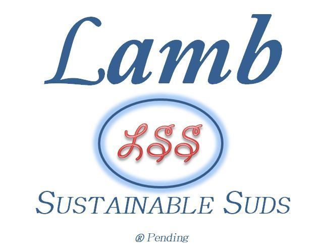
I apologize if anyone felt I was attacking them. I was brainstorming with everyone here and taking EVERY ONE's comments very seriously. In fact, the posts about the lamb pic AND the very helpful CAMAY photo gave me an idea.

Lamb%20LSS%20Logo_zpssynu4y4c.jpg
 
So much has been said, but let me also add that there is much more to graphic design than taking the color, picking a similar font and switching out animals (lamb for a dove) to create an equally well designed logo. A design can have those elements as the base of a concept but the designer would pull them together in a way that is esthetically pleasing. Spacing, proportions, contrast, thickness of the lines make a huge difference as well. Maybe you should stay true to your concept but take some previous posters advice and get a design student to look at it.

On the other hand, if you really don't want to go through the trouble, that's your choice as well. I love the name, and I think that the idea of the lamb is nice. You can always rework the look in the future if you decide to appeal to a broader audience.

Thank you for the feedback, it is much appreciated! In fact, the lamb seemed to invoke so much emotion here that I was getting a little nervous and changed it. The only people who knew I switched it out were the people here and when I told them... Oh well... I guess they felt it was some sort of psychological experiment when in fact it was nothing more than trying to get a quality logo quickly.
 
Hey Tbeck3579
Here is my prototype for my box. We are finalizing this and sending to my local print guy and old timer here in the valley been in business since 1930 .. he will score them and i will just have to bend them

300 for 135.00 this box will be High Gloss black letters. I will foil them myself.

Chprototype.jpg
 
Well, this escalated quickly...

Personally, I feel like you are dismissing the opinions of some very talented and experience people here - opinions which you asked for, might I add. Instead, you've decided that we all need an in-depth lesson on psychology (I, too, have studied psychology at undergrad level) and want us to say that yes, your logo is just like Dove and that automatically means that everyone will buy it, la la la...

It doesn't appeal to me, but it might do to others. To me, it looks old-fashioned and dated, and I really think you ought to take a step back and re-read some of the great, constructive criticism that has been handed to you freely from the lovely people on this forum.

If this was some sort of odd psychological test, then I'm just annoyed that so many of us have wasted our valuable time trying to help you with a logo, only for you to throw it back in our faces. Just my two cents.
''

I wasn't dismissing anyone or their opinions. Yes, emotional here. People felt duped and that wasn't the intention.
 
Ouch dahlia. let us be open minded here. Depending on the audience she is trying to reach . Her brand though may be simple can actually turn out well in her local community.

Simple is always Best. that what hold true to this day. I have been in Pr for a while and now that Simple is best. Also the right PR to push your product is another avenue.
so taking your soap on the road and giving it away in other areas of your state etc.
it really depend again on what she want and how far is she willing to go with this product.
I have never went to art school but I AM a natural artist. not taught. I have designed all my logos. and have Artist give me nothing but hand downs. so ART SCHOOL MEANS NOTHING. IT YOUR CREATIVE EYE THAT COUNTS


Tbck as sharp as you are, it is pure Bs what you trying to push on us. I do not want to say it, but I finished fine art school in Europe and worked as fabric desinger for years.
I would not expose anyone to label or Logo as you call it........You telling us about your psychology and how educated you are.........I am laughing out loud lady, I am :)) truly
 
Hey Theresa, just in case you missed it, I am a Christian, and while I understand that you are selling to a church crowd, this use of a lamb just feels wrong to me. I get the symbolism, but no, just no.

I would more likely hit the "pure and gentle" harder than the lamb. I would also avoid using the "soothing" shades of blue. You don't want to bore folks away from the table. Hit their eyes with some bold, bright, and aggressive colors(red, bright blue, yellow). Then suck them in with lovely scents. If you don't get their attention fast and hard, you will have them walking away.
 
Hey Tbeck3579
Here is my prototype for my box. We are finalizing this and sending to my local print guy and old timer here in the valley been in business since 1930 .. he will score them and i will just have to bend them

300 for 135.00 this box will be High Gloss black letters. I will foil them myself.

I love it! The rose is simple and feminine. My first thought was "I want to know what that pretty rose is representing." I was immediately drawn to it.
 
exactly . i WAS RAISED christian beliefs. my grand parents. and I respect her logo. The Lamb is Innocent and Pure. just as God want our souls to be :)

and her soap are Pure from the land that god has given to us .. so YEAH it NICE.. i would circulate it in CHURCH stores that sell bibles etc

Hey Theresa, just in case you missed it, I am a Christian, and while I understand that you are selling to a church crowd, this use of a lamb just feels wrong to me. I get the symbolism, but no, just no.

I would more likely hit the "pure and gentle" harder than the lamb. I would also avoid using the "soothing" shades of blue. You don't want to bore folks away from the table. Hit their eyes with some bold, bright, and aggressive colors(red, bright blue, yellow). Then suck them in with lovely scents. If you don't get their attention fast and hard, you will have them walking away.
 
Ouch dahlia. let us be open minded here. Depending on the audience she is trying to reach . Her brand though may be simple can actually turn out well in her local community.

Simple is always Best. that what hold true to this day. I have been in Pr for a while and now that Simple is best. Also the right PR to push your product is another avenue.
so taking your soap on the road and giving it away in other areas of your state etc.
it really depend again on what she want and how far is she willing to go with this product.
I have never went to art school but I AM a natural artist. not taught. I have designed all my logos. and have Artist give me nothing but hand downs. so ART SCHOOL MEANS NOTHING. IT YOUR CREATIVE EYE THAT COUNTS

I am not closed minded, I have open mind to all possibilities, The only thing I hate is when someone belittle others. It will get to me every time. You know that this forum is very kind to every one and helps and advice , spending a lot of time to help others to start the business or to achieve a good product....I love this place.
Please do not criticize artists, they are hard working people. I am very happy you have an artistic ability (many people do) and know how to utilize it. ;))
I had not intention of insulting anyone, if I had, I say I am sorry!!!
 
Last edited:
Hey Theresa, just in case you missed it, I am a Christian, and while I understand that you are selling to a church crowd, this use of a lamb just feels wrong to me. I get the symbolism, but no, just no.

I would more likely hit the "pure and gentle" harder than the lamb. I would also avoid using the "soothing" shades of blue. You don't want to bore folks away from the table. Hit their eyes with some bold, bright, and aggressive colors(red, bright blue, yellow). Then suck them in with lovely scents. If you don't get their attention fast and hard, you will have them walking away.
If you want unbiased opinions you can't give background information, or that will bias the responses you get. No one here got the "symbolism" or the relation to Dove until I told them. It only got emotional when I explained it was based on the best selling soap logo, and what the lamb represents (and the DOVE was used in a similar manner). I'm guessing you've seen the lamb and dove used in marketing and never made the connection until now. Now, everyone is biased which is why I DID NOT explain where the inspiration came from. I like the saying "lies, damn lies, and statistics" (Mark Twain). I can bias any study I want by giving specific information, and most studies are biased. I wanted HONEST opinions and I wasn't trying to dupe anyone. The emotion is running so high on this thread now that any response I get is likely to be biased.
 
I really hope I'm not going to offend anyone with this... I'm not Christian so I didn't think "lamb of God". I thought "lamb skin"... Maybe it's the font or spacing.

If I had thought of your original intent, it would have turned me off buying as I like to keep religion out of my products.

But I'm probably not the target audience anywho.
 
Hey Tbeck3579
Here is my prototype for my box. We are finalizing this and sending to my local print guy and old timer here in the valley been in business since 1930 .. he will score them and i will just have to bend them

300 for 135.00 this box will be High Gloss black letters. I will foil them myself.

I think your box and logo are gorgeous. To me they invoke luxury, high end product. I would want to know what the soap was like by looking at the box. Awesome job!
 
Theresa, I actually got all the symbolism when I saw the label the first time. However, that original logo still screams baby products or wool to me. Sorry, but it really does. However, when you started explaining what you were going for, and I understood the market you were appealing to, I then could actually give you what seemed to me more helpful feedback. If it wasn't helpful, then take my apologies, instead.
 
Ouch dahlia. let us be open minded here. Depending on the audience she is trying to reach . Her brand though may be simple can actually turn out well in her local community.

I have never went to art school but I AM a natural artist. not taught. I have designed all my logos. and have Artist give me nothing but hand downs. so ART SCHOOL MEANS NOTHING. IT YOUR CREATIVE EYE THAT COUNTS

Whoa. I hate to get too far off topic but I have to disagree. While yes it is possible for people to have natural ability, being educated in something does represent a mastery/level of knowledge that exceeds a previous natural ability. I know a highly educated artist and I respect all of the hard work that she put into studying her field. Yes she had an eye and a talent before she stepped foot in anyone's school but she also learned a lot during her studies. I would just like to ask that we respect people's areas of expertise.
 
However, that original logo still screams baby products or wool to me.

No reason to be sorry. The reason it screams it is because corporate America's marketing gurus have made it so. It didn't happen by accident, and the American people didn't realize that they were brainwashed. We are all victims :cry:
 
Arts school teaches HISTORY of art and reinforce a natural talent.. Before there was history. we had natural artist LMAO.. the ones we go see in the Museums.. so yeah I kinda disagree and agree.. for someone who has no natarual ability. Oh and all the Rock carveer of rome and all the Ruins of Egypt I can go on. this is needed yes for Informative history. but we have a natural ability. that we re infornce with education. but I agree to disagree..

Whoa. I hate to get too far off topic but I have to disagree. While yes it is possible for people to have natural ability, being educated in something does represent a mastery/level of knowledge that exceeds a previous natural ability. I know a highly educated artist and I respect all of the hard work that she put into studying her field. Yes she had an eye and a talent before she stepped foot in anyone's school but she also learned a lot during her studies. I would just like to ask that we respect people's areas of expertise.
 
Just jumping over all the prior explanations and all, your second label is more appealing but I would consider trying different fonts for the LSS part in the oval. It doesn't seem to fit with the rest, in particular, and it seems like there could be some other slight changes to make the label cleaner.

You mentioned have just a split second to grab someone's attention then you could explain about your ingredients and what you are going for. I agree and disagree. You do have just a moment to make the impact and draw the eye. You first label did not have that draw for me and I would have passed it by. I don't necessarily think once you have caught the eye, you then have all the time to explain about your wholesome ingredients and how it's made etc... You will have a very short period of time in which to get someone interested enough to read your label and understand the nature of your products, unless you plan to talk extensively with each person who takes a second look at your soap. In a business/booth setting, that is not going to happen. Your label has to be able to convey some of that right away.
 
Last edited:
zolveria said:
Arts school teaches HISTORY of art and reinforce a natural talent.. Before there was history. we had natural artist LMAO.. the ones we go see in the Museums.. so yeah I kinda disagree and agree.. for someone who has no natarual ability. Oh and all the Rock carveer of rome and all the Ruins of Egypt I can go on. this is needed yes for Informative history. but we have a natural ability. that we re infornce with education. but I agree to disagree..
Have you any idea how many years Rembrand spend to achieve the mastery, painting for others? Do you have any idea how many drawings Leonardo Da Vinci made before he got it right?
Every artist and their masterpieces was a lot of work , tears, and sweat before it went to museum. Actually only Pablo Piccaso could support himself with paintings. Look at the Dutch artist. Vincent Van Gogh, all life in poverty and then boom , after he died his paintings are good enough to go to museum. Small paintings of his is selling for 30 millions US of course.
Zolveria of course the talent must be there, but to create masterpiece it is only 10% of talent and 80% of work.
Anything good needs a lot of work, as soapmaker you should know that:))
 
Last edited:
Just jumping over all the prior explanations and all, your second label is more appealing but I would consider trying different fonts for the LSS part in the oval. It doesn't seem to fit with the rest, in particular, and it seems like there could be some other slight changes to make the label cleaner.

You mentioned have just a split second to grab someone's attention then you could explain about your ingredients and what you are going for. I agree and disagree. You do have just a moment to make the impact and draw the eye. You first label did not have that draw for me and I would have passed it by. I don't necessarily think once you have caught the eye, you then have all the time to explain about your wholesome ingredients and how it's made etc... You will have a very short period of time in which to get someone interested enough to read your label and understand the nature of your products, unless you plan to talk extensively with each person who takes a second look at your soap. In a business/booth setting, they is not going to happen. Your label has to be able to convey some of that right away.

Thank you for the feedback, it is VERY helpful. It appears you may have some specific ideas on colors, fonts, etc. and I would greatly appreciate any feedback (maybe I'm reading too much into to your post?). The logo/name will help draw people in. Unfortunately the marketing and sales aspect has more to do with "a hook" then it does a good product (sigh). The rest of the packaging and signage will focus on why it is pure/natural/sustainable and superior to the mass-market brand of chemical laden, skin drying "beauty bar" alternatives. If all goes well I'll be appealing to their cerebral emotion of "I want a healthy, chemical free product for me and my family". The scent is (do I dare say it) a HUGE psychological draw and it is very important. If they get close enough to the booth I want the right scent wafting in the air -- not overpowering, just a response of "mmm, what is that?" emotion.

The "I gotta have it" buying emotion is what I want now -- a lot of work to help charity -- I'm wishing I hadn't started this, but in for a penny in for a pound. Hopefully they will respond unknowingly with "I will pay more because it is better". If I can get them close enough to smell and do a quick read they can make up their own mind. I'm still working on a "tag"; that first piece of "real" information.
 

Latest posts

Back
Top