SoapCalc is under new management

Soapmaking Forum

Help Support Soapmaking Forum:

This site may earn a commission from merchant affiliate links, including eBay, Amazon, and others.
I usually use soapcalc just because it is the one I started with, but think I go to soapee, which I do use for dual lye soaps, for all my soaps. The colors on soapcalc are awful. I also vote YES to SMF calculator
 
I haven't noticed the ads. My ad blocker is really awesome. I read through the things I missed and now I'm somewhat sure it might be a cookie setting for some of you not seeing the new background. I'm gonna go now.
 
That's why I'm not seeing the problems you all are!
Color blind - at least according to Jan. I see the same way I always have as do all the men in my family...

Ah, yes, there it is, in all its glory, the colors finally showed up on my PC too. Yay o_O

Btw, I wonder how SapCalc will look like for those that are colorblind, and more specifically those with Protanomaly, they won`t be able to see the helpfull links or anything highlighted in orange because they can`t see any shades that is in the red family. I don`t know, perhaps it turns brown?
But the background is already dark brown/grey so...
Perhaps there aren`t any colorblind soapers out there?

A lot of new oils added too, that is great! Although, Salmon oil, that would make an interesting soap. Suitable for fishermen perhaps. Yes I do see the fault in my reasoning... : P

Added oils doesn`t make me love the grey-brown/orange combo any better, though.
I am really trying, but... : P
 
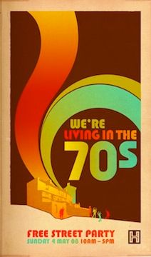
The main area where you look up oils and enter in your formula shows up as light-medium turquoise for me on my home PC screen (which to me is actually quite nice), but the surrounding outer background frame is an ugly, dark greyish-brown, with orange, pukey-yellow, and lime-green links. Not only does it make it hard on the eyes, but blech and ptooey!! It reminds me of some of the really bad, wacky-tacky color schemes that dominated in the '70's. They need to be put in a locked vault somewhere and the key thrown away.
The blinky ads have been there for awhile for me- at least over a year or more to my recollection, because I've actually clicked on some of them over the past year or 2- such as the Elements Bath & Body ad, but they were definitely much less noticeable/annoying against the backdrop of the old color scheme for sure.

Following the tip by techiemeka who posted earlier, I enlarged my viewing screen to 250%, and the ads can no longer be seen.


IrishLass :)
 
But luckily they didn't make any changes to the "view or print recipe" page so I'm thankful for that. I spend a short amount of time on the first page entering in the oils and percentages then a longer amount of time typing in the specific recipe details. Now with my page size enlarged (thanks for the tip Chefmom!) I don't get those horrible ads in my periphery. But I still vote for an SMF calculator. :)
 
as a soap newbie i definitely vote for a SMF soap calculator. soapcalc is not intuitive to use unfortunately and the actual design well...let's just say it leaves a lot to be desired. i am sorry to hear the owner is having health problems though and it's a great thing to make available for free.

The main area where you look up oils and enter in your formula shows up as light-medium turquoise for me on my home PC screen (which to me is actually quite nice), but the surrounding outer background frame is an ugly, dark greyish-brown, with orange, pukey-yellow, and lime-green links. Not only does it make it hard on the eyes, but blech and ptooey!! It reminds me of some of the really bad, wacky-tacky color schemes that dominated in the '70's. They need to be put in a locked vault somewhere and the key thrown away.
you mean like this ;)
 
Last edited:
Wow, that color scheme! Had to look it up today just to see.

It hurts to look at it for too long. The orange links on grey, red plus signs on turquoise. I hope this is just temporary!

I too am sad to hear the owner of soap calc isn't doing too well.

I would love an SMF calculator just because it would be great to have a native calculator to point newbies to and also not have to leave the website to answer calculator related questions.
 
I'm glad I was able to help.
And many thanks to Chefmom for reminding us how to enlarge the page, I must have done that long ago and they broke that too when they messed it all up.
Maybe this was all a clever plot by the folks at SoapCalc to see how many users they have? (Of course that only works if we complain to them about it)
 
Last edited:
you mean like this ;)

The photo isn`t showing up, perhaps you either changed your mind and deleted the photo, or moved it so the link is invalid?
The kitty is cute and all, but you can edit your original post and change the link, or delete it : )
 
The variations in how people are seeing the color scheme probably have to do with whether and how recently your browser has cached the page.

Those who use Chrome can modify their Custom.css file to (usually) force background and font colors independent of what the website designers intended. Google it if you want to try this route, but here's something to get you started.

There are also extensions for Chrome (and likely for Firefox - though I haven't checked) that will make this easier, and allow selective application among websites - which modifying Custom.css will not.
 
Depending on your browsers, maybe you guys should try Adguard and see how you do. I stopped using Adblock a while ago and I have no complaints.
 
The variations in how people are seeing the color scheme probably have to do with whether and how recently your browser has cached the page.

Those who use Chrome can modify their Custom.css file to (usually) force background and font colors independent of what the website designers intended. Google it if you want to try this route, but here's something to get you started.

There are also extensions for Chrome (and likely for Firefox - though I haven't checked) that will make this easier, and allow selective application among websites - which modifying Custom.css will not.

Stylish, I believe, is one of those add-ons. When I have time, maybe this evening, I need a break from truck shopping, I'll see about writing a style to change the background color at least.
 

Latest posts

Back
Top