Logo Choices

Soapmaking Forum

Help Support Soapmaking Forum:

This site may earn a commission from merchant affiliate links, including eBay, Amazon, and others.
I like the rainbow of colour across the top of 1 but not the font, and no 6 is pretty good, but I like the pink a bit darker / brighter. Having said that though I have not looked at them on pc only on tablet, so I dont know if the colour is bright or not on pc screen.

Are there any good label designers out there who dont cost an arm and a leg?
I can do my own labels, but am never happy, always "tweaking" them - I drive myself nuts over it in fact.
 
It seem that I am the only one who loves second one; neat and very much like I see logo:)) My second choice would be third one. :)
 
First or last one. I like clean, straight-forward designs, and a lot of the second batch you were sent seem very "fussy" or "busy" to me. I don't mind stylised images, but the one that is supposed to represent the back of a person is TOO stylised and not stylISH enough, in my opinion. It also looks feminine, which may or may not be an issue (if you sell primarily to women, not so much, but if you have a men's line, it may not be the right visual)
 
I like the last one best too.

The first one is a bit busy and I think the 2 fonts are too incongruous. Maybe with a different font on the second line, it would feel more put together.

Second one makes me think of a paint store, for some reason. Somehow it doesn't feel like it's about bath and body products.

The third leaves too much open space. It's like the logo is an afterthought. If it were centered on the card, I think it would feel better, but nothing about it catches my eye except the wide expanse of emptiness. It's also too pink. There isn't enough balance in the coloring.

The fourth is too elaborate for my personal tastes. It's hard to read on the screen, but that's because it's small. I don't know how it would look as a label, but again, it's just a bit busy to me.

The fifth- well, I would just toss it. I get what the person is going for with the font but it just looks bloated, overstuffed. It's unattractive to my eye and the way the letters are full feels more like tension than relaxation.

THe 6th is pretty good. I like the bubbles, the balance of colors is better, it's simple and fairly clean. it's the one that catches my eye immediately.

That's my two cents, coming from a consumer standpoint.
 
Last edited:
The last one, definitely.

The first is not too bad but the two fonts don't look right together. I do like the rainbow colour across the top though.

Number 3 looks like a pair of pink boxing gloves.
 
The following is my opinion nothing more or less. I'm not sugar coating any of this so please do not be offended by what is only my opinion.

Out of the six newly posted

The first I see as more childlike. I think it would be a great logo for a childs play place but not for a soap logo.

The second is ok but the N is lost in that bubble and the More seems to large and overbearing.

The third is ok but very monotone, not enough zip in it - it seems to blend in.

The fourth I have a hard time looking at. It is way too busy unless you are wrapping your soaps for sale in lace.

The fifth - again too childlike and too "smeared" (for lack of a better term) it seems too squashed together.

The sixth I like but I think I'd like it better with more color. Nothing rainbow or anything maybe one brighter accent tone. The design is good easy to read I like the underline, it is not overdone.
 
Just figured out how to make those logos large enough to see well, and while I still like the last one best, could you get the artist to border the pink letters with black to make that pink pop more?
 
The only one I liked, was the first one next to the number 7 and I thought the colors used went nicely together. I think the very last one is nice too, but also thought it needed a few more bubbles, both white and blue. JMHO. I didn't like the techy designed versions using the red letters at all. I thought it detracted from the fun'ness of your soaps.
 
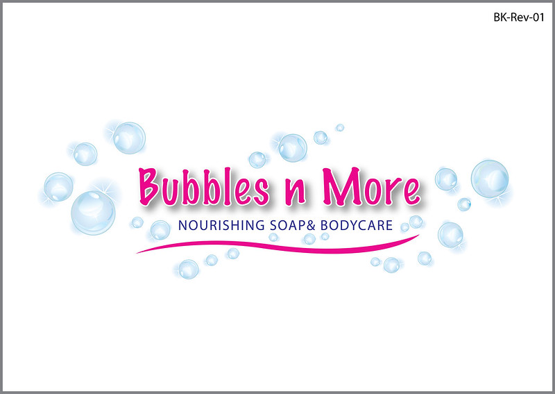
here is the latest update to logo process. What do you think about this one?


working on a label mockup to see how it might look on a soap label.
 
Last edited:
I like that but where the Bubbles n More is outlined in white I would try using a POP color, something bolder for an accent. (Honestly I'm not sure what it would look like but it is the first thing I would try changing to enhance the logo) Maybe try using the purple/blue color that the next line uses.
 
I like the bubbles. I have a question though: is the "&" off-center, or is it just me? It seems like the space after "SOAP" is missing.
 
I agree with the comment about the outline being more of a contrasting color rather than white and the spacing does need adjustment. I like Handcrafted or Artisan better than Nourishing, though. Overall, I like this logo.
 

Latest posts

Back
Top