Logo Choices

Soapmaking Forum

Help Support Soapmaking Forum:

This site may earn a commission from merchant affiliate links, including eBay, Amazon, and others.

kylie_au

Well-Known Member
Joined
Jun 18, 2014
Messages
79
Reaction score
43
When i first started selling, which was just a couple of local markets in country towns, i had a cute little flower.
Then, when i could afford it i paid for logo design, this is where that took me


Then life got in the way and i've missed it everday these past couple of years.

Now i am getting back to what i love best, i decided to look at a new logo, again paid for


At first i was happy enough with the latest version, but for some reason i'm just not sure.
So, i thought i would share with all of you and see what you all think.

This is another concept they sent:

NEW CONCEPTS

So what do you all think of these?
 
Last edited:
I like the clean, fun look of the first logo and the wording in the second logo. Not much help, sorry. The second logo is more 'sophisticated'. Either way, both are well done.:thumbup:
 
Personally, I prefer the second one. I like the first one, the second just appeals to me more.
 
I agree the 1st is fun and the 2nd is more sophisticated. My eye was drawn to the fun. Something about the scattered bubbles really made me smile. I guess it'll depend on the look you're going for - fun or sophistication. Maybe a blend of them by adding some bubbles floating out of the top of the image on the left? I'm no graphic artist that's for sure so it may not work for you. Both look great though and I like the simplicity of text and graphics! :razz:
 
Like most of the others, I like the font better in the second one, but I like the look of the first. I'm confused by whatever that is to the left on the second one. Are they cattle horns with bubbles between them? I can't tell what it is. I think the bubbles look too contained. They should be more random, like in the first one.
 
Like most of the others, I like the font better in the second one, but I like the look of the first. I'm confused by whatever that is to the left on the second one. Are they cattle horns with bubbles between them? I can't tell what it is. I think the bubbles look too contained. They should be more random, like in the first one.

I had to smile at this comment. No not horns, i think it is probly meant to be a " from behind" symbol of a body. you know think of a person sitting?
Well that is what i thought it was meant to be.
 
The first logo does have that fun & funky vibe to it, and i did love that.
Is it too funky?
Is it more memorable?

The second is more sophisticated.
Is it more memorable?

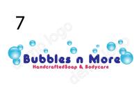
I have added one of the other design concepts that was sent to me .
 
I like the clean, fun look of the first logo and the wording in the second logo. Not much help, sorry. The second logo is more 'sophisticated'. Either way, both are well done.:thumbup:
+1 to that ... ask if they can make that change maybe>

I had to smile at this comment. No not horns, i think it is probly meant to be a " from behind" symbol of a body. you know think of a person sitting?
Exactly where I was going ... it looks like a person about to do terrible things with bubbles in their body.
 
My immediate thought was 'back of a naked woman with a flatulence problem'.
Sorry.
Prefer the other one.
 
I strongly prefer the look of the first one. Don't care for the second one at all, and the third one is ok, but forgettable. First one is cute though.
 
Oops, I didn't even see the 3rd one! I like it but not as much as the first one. What I like is the word handcrafted instead of natural. Just my preference.
 
My immediate thought was 'back of a naked woman with a flatulence problem'.
Sorry.
Prefer the other one.

ROTFL.....yup, all of those bubbles have to go somewhere! OK, now I like the look of the third, but using the font of the second. I think the font in the third one looks kind of juvenile.
 
Ok, have decided to go for 3rd time lucky. I'll post new logo concepts in a few days when i get them.
 
Guys do not get me wrong but paying for such poor design is outrageous. Please choose the artist someone who is a designer and get nice logo. Sorry to burst the bubbles...:(
 
I would combine the font and line of the second one with random bubbles of the 1st and 3rd one. That's just me. :)
 
Guys do not get me wrong but paying for such poor design is outrageous. Please choose the artist someone who is a designer and get nice logo. Sorry to burst the bubbles...:(


Who do you recommend?
 
I like the second one. But I agree this is basic design work.
 
I would combine the font and line of the second one with random bubbles of the 1st and 3rd one. That's just me. :)
That was exactly what I was thinking! And BTW, my first impression of the pic in the second was that it was an odd rendition of reproductive organs with bubbles :problem:
 
Back
Top