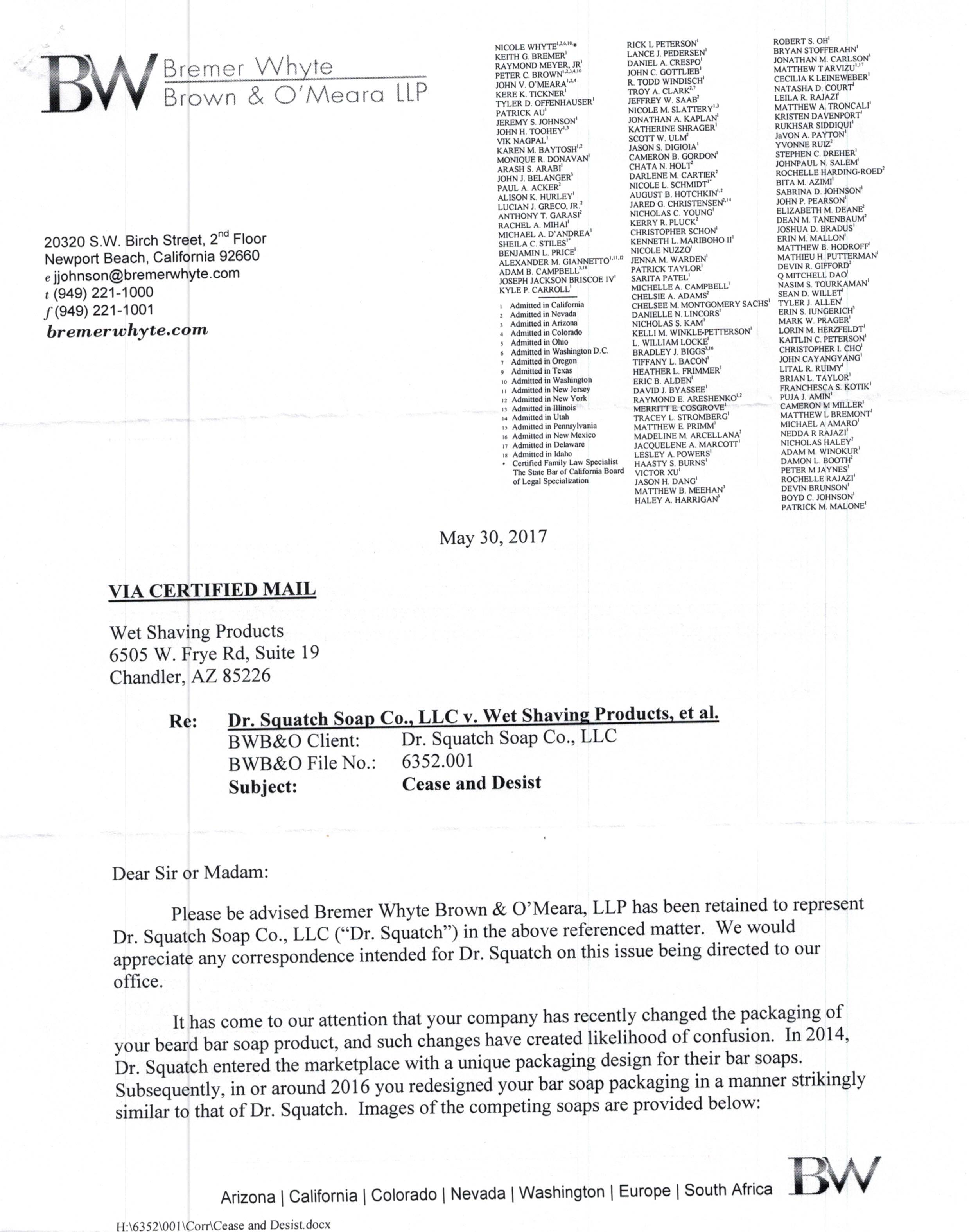
So I received this certified letter in the mail yesterday...

Soapmaking Forum

Help Support Soapmaking Forum:

This site may earn a commission from merchant affiliate links, including eBay, Amazon, and others.
Status
Not open for further replies.

wetshavingproducts

Well-Known Member
Joined
Jun 19, 2014
Messages
245
Reaction score
145
I'm not asking for advice. I know what needs to be done. But I'll just leave this here and you can form your own conclusions and if you want to discuss, I'm happy to talk about it.

EJAvGpp.jpg

ciPTZOw.jpg
 
They're not claiming trademark infringement, they're claiming this weird little area of the law called trade dress. They're saying their customers are being confused by the packaging as to whose is whose.
 
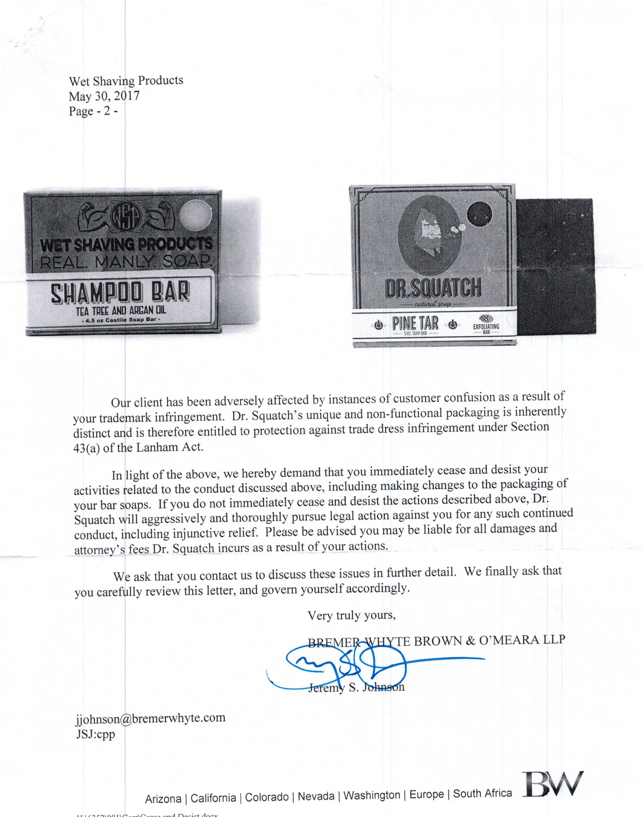
I'm not a lawyer and don't play one on TV. The only similarities I see between their packaging and yours is the font . . . along with your white circle in the upper right corner vs their black circle in the upper right corner. Is that seriously enough to meet the criteria for a trade dress lawsuit?
 
They're saying their customers are being confused by the packaging as to whose is whose.

I would think the completely different company names and totally different design of company logos would make it blatantly obvious as to whose is whose (don't their customers read labels?), but what do I know? The suspicious part of me makes me wonder if they are not using 'customer confusion' as a front for something else.

The letter states that their packing is 'unique' and 'inherently distinct', but the only thing 'unique' and 'inherently distinct' that I can see on their packaging is the picture of the pipe smoking, bearded sasquatch dude, and the name 'Dr. Squatch'- neither of which you have on yours- not even anything close to that.

The box is certainly not unique- Kraft sells those in bulk online to anyone, complete with the circle cut-out in the corner. Lots of soapers use them. Are they going to send 'cease & desist' letters to them, too?

The fonts they are using are not unique to them either, nor is the border that runs along the edges of their box, nor the placement of the sticker identifying the type of soap inside. They look just like the fonts and borders and sticker placement that I see on thousands of other company's packaging. The only thing distinctly unique is the name and logo.

My hubby, who doesn't suffer fools gladly, thinks it would serve them right if they were 'Twitter-shamed'. :razz:


IrishLass :)
 
Unbelievable that customers confuse your rectangular shaped soap's packaging for the other square shaped soap's 'unique and non-funtional' packaging. (And what does non-functional packaging even mean?)

The font is not the same. Notice the B on your soap's packaging and the B on his Bay Rum soap (on his website). Not even a match. The only similarity between fonts that I see is the drop shadow and using all caps. (I went to both yours and his websites to get a better look at the packaging of bar soaps.)

I guess the cigar band type part of the label is similar, but is it similar enough that it's forbidden on your Wet Shaving Soap packages when it's in a box with a cut-out hole and lines around the edge? Maybe so if he is so very well known and his products have been around for a long time, but it sure seems more than nit-picky.

BTW, he claims his soap is natural (checked out a blogpost via a link on his site and he says so.) Now I'm being nit-picky.
 
That's the only thing I noted that looked even remotely similar- the text font in the bar description. But, it hardly creates brand confusion...I'm not an expert either, but I think this would be really difficult to prove.

The problem this comes down to is who's got enough money to fight this out in court. Yeah, the burden of proof is on Dr Squatch if it did go to trial, and I expect loss of business due to 'confusion' would be really hard to prove.

They're counting on Wet to fold like paper and not actually confront them. That's the thing about some of this stuff that irritates the every loving daylights out of me. It's never about who's actually been wounded and whether or not the proof is there, it's just who's got the deepest pockets to keep paying the lawyers. If this were the other way around there wouldn't be a whole lot Wet could do besides shame the hell out of them all over social media.
 
I like your packaging! I like the dr squach packaging too, and there is no way I would confuse the two! The only similarities I see are generic and do not define either brand. It makes me wonder how many other businesses received a cease and desist from them. It would help if they were explicit about what they want you to change. Hrumph.
 
I'm not a lawyer and don't play one on TV. The only similarities I see between their packaging and yours is the font . . . along with your white circle in the upper right corner vs their black circle in the upper right corner. Is that seriously enough to meet the criteria for a trade dress lawsuit?

Well, luckily for me I am a lawyer and can do legal research, and my research says an emphatic no unless they can somehow prove actual confusion, but my god I cannot fathom the ***** they'd have to drag in.

"So this box a rectangle and has WSP plastered everywhere, and this box is a square with a weird robe wearing mascot with bubbles on it. Are you confused as to whether these brands are the same?"

The box is certainly not unique- Kraft sells those in bulk online to anyone, complete with the circle cut-out in the corner. Lots of soapers use them. Are they going to send 'cease & desist' letters to them, too?

My hubby, who doesn't suffer fools gladly, thinks it would serve them right if they were 'Twitter-shamed'. :razz:


IrishLass :)

Do you have a link? That may prove very useful if they actually issue a complaint. And just more icing on the cake if they keep sending me letters.

Feel free to share. I didn't write it. I give you free license to the photos.

Unbelievable that customers confuse your rectangular shaped soap's packaging for the other square shaped soap's 'unique and non-funtional' packaging. (And what does non-functional packaging even mean?)

The font is not the same. Notice the B on your soap's packaging and the B on his Bay Rum soap (on his website). Not even a match. The only similarity between fonts that I see is the drop shadow and using all caps. (I went to both yours and his websites to get a better look at the packaging of bar soaps.)

I guess the cigar band type part of the label is similar, but is it similar enough that it's forbidden on your Wet Shaving Soap packages when it's in a box with a cut-out hole and lines around the edge? Maybe so if he is so very well known and his products have been around for a long time, but it sure seems more than nit-picky.

BTW, he claims his soap is natural (checked out a blogpost via a link on his site and he says so.) Now I'm being nit-picky.

It's a legal standard if they decide to actually try for the real trade dress protection of inherently distinctive, which they absolutely cannot do as every element of their design is either generic or functional. But the lawyer put it in just in case.

No, the font is not the same. The only similarity is a drop shadow which is ubiquitous in design and fonts in general.

Since a cigar band is widely used in the industry, it's probable that it's just a generic design choice. However, since it reduces the cost & serves as a tamper evident seal, it is functional and not deserving of trade dress protection.

A cutout is generic as ****. No protections whatsoever.

He's only been around since 2014 according to the letter, so I actually predate him as a company, but my packaging does not predate theirs. But as everything they use is generic and basically looks like every other soap box, he cannot possibly get distinctiveness.

They buy their soaps from thesoapguy. Don't even bother to change the scent names. No joke. Go look.

https://thesoapguy.com/masterloavespage.html
 
Bwahaha! So the scary lawyer letter that would freak someone else out just made you do a Dwayne Johnson eyebrow, I take it.

My initial reaction was "WTF? You can't be serious?" My next reaction was throw it in the trash and see if they wanted to send me additional letters. My final reaction was "I'm going to post this on social media and let it backfire on them." Oh, and I actually responded to suck up some of their legal retainer and just annoy the ***** attorney who didn't bother to read the letter he signed.
 
Wow, they picked on the wrong guy! Checked out their website...very ugly logo.

Throwing money down the drain must be part of their business plan because along with this frivolous lawsuit their Google Adwords Ad comes up when you search on the business name!

On a serious note, I wonder how many other people the lawyer has contacted and how freaked out they are :(
 
Status
Not open for further replies.
Back
Top