Well not so sweet of me, I kinda have a vested interested for the new owner to succeed... He needs the booth fees I do not payWow, that was really nice of you, Carolyn. I suspect most people would not have been so generous.
You are using an out of date browser. It may not display this or other websites correctly.
You should upgrade or use an alternative browser.
You should upgrade or use an alternative browser.
Not Ready To Sell, However
- Thread starter commoncenz
- Start date

Help Support Soapmaking Forum:
This site may earn a commission from merchant affiliate
links, including eBay, Amazon, and others.
tbeck3579
Well-Known Member
I really like it. Logo's/labels are emotional/psychological and mfg co's spend billions (no joke) on the psychology of getting the public to buy their product. They get a split second to make an impression and get the consumer interested enough to look at yet ANOTHER product. If you use a logo that resembles a company who already spent billions to get the public to remember them (subliminal messages work!) a lot of work has already been done for you, the foundation has been laid. Remember, it is a split second emotion. If you see a yellow arch do you think of St. Louis or McDonald's?
All this leads me to my first impression of your label, the feeling I got when I saw the label. I felt, at the moment I saw the label, that it was attractive and masculine, something a guy would like. That was my "knee jerk" impression, and that was before I looked to see that you are a guy 8) Cool eh? Psychology fascinates me. All of us bring bias to the table and gender is a big one -- we are human -- we can't help it.
I don't have a clue about the buying demographics of soap consumers (age, religion, ***, race, socioeconomic status, income, etc.), but I assume the vast majority of soap is purchased by women (could be my bias, but I would place odds it is). I like your label very much and I'm not trying to say it should be more feminine because I am in no way, shape, or form a marketing expert. Just giving you my "off the cuff" intuition.
Last edited:
It's amazing how you can be satisfied with something when you just don't know any better and once you do learn better, you look back upon your ignorant self and cringe.
Yes, it's definitely a process. I have made websites for my own businesses and when I look back at the first one I made 15 years ago (that I was SO proud of) I just cringe! :lolno:
Last edited:
I was vaguely thinking of the Rocky Top Soap Shop: www.etsy.com/shop/RockyTopSoapShop
He keeps it really simple, with kraft labels and a rustic look. And look at the sales...!
That's a great idea
You're welcome. This font is called CF Trash Zone and I got it from DaFont.com
They have lots of rustic type fonts....
He keeps it really simple, with kraft labels and a rustic look. And look at the sales...!
I really like Aline's rustic version too. Maybe you could find a border that looks like bricks of soap to frame the lettering?
That's a great idea
Funny thing is that I live in a very rustic/rural area. Yet, the idea of "rustic" and or "hardworking" didn't pop into my head because I've spent days looking at what others have done. Silly me. That idea is perfect for the area and the concept.
Oh well, I knew I'd probably go through about 20 or so designs and/or ideas before I settled on one.
Thanks again for the nudge Aline.
You're welcome. This font is called CF Trash Zone and I got it from DaFont.com
They have lots of rustic type fonts....
clownking99
Well-Known Member
- Joined
- Aug 5, 2015
- Messages
- 86
- Reaction score
- 22
Id have the word soap darker and handmade to the right of the bottom of the hands
Lookin good
And that etsy dude , his packaging - it looks good and easy tonread, but everyone does that it seems :-0
Lookin good
And that etsy dude , his packaging - it looks good and easy tonread, but everyone does that it seems :-0

$11.99 ($3.00 / Fl Oz)
Ethereal Nature 100% Pure! Peppermint Oil – Perfect For Aromatherapy Diffusers, Skin, Nail and Hair Care – Beauty DIY – 4 FL OZ
Amazon.com

$18.99 ($0.59 / Fl Oz)
Parachute Naturalz Virgin Coconut Oil | 100% Organic Cooking Oil, Hair Oil and Skin Oil | Cold Pressed | USDA Certified | 32 Fl. Oz | Plastic Jar
Marico Ltd. (Manufacturer/ Brand owner)

$24.96 ($0.31 / Ounce)
$32.00 ($0.40 / Ounce)
Primal Elements White Soap Base - Moisturizing Melt and Pour Glycerin Soap Base for Crafting and Soap Making, Vegan, Cruelty Free, Easy to Cut, Unscented - 5 Pound
Amazon.com
$25.99 ($0.32 / Ounce)
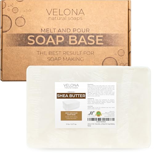
velona 5 LB - Shea Butter - Melt and Pour Soap Base SLS/SLES free | Natural Bars for The Best Result for Soap-Making
Velona
$7.99
$9.99
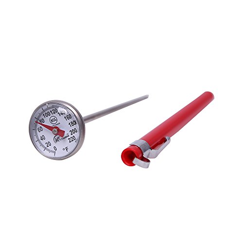
KT THERMO Instant Read 1-Inch Dial Thermometer,Best for The Coffee Drinks,Chocolate Milk Foam
BestPartners

$14.39 ($7.05 / Fl Oz)
$16.99 ($8.33 / Fl Oz)
P&J Trading Fragrance Oil Gentlemen's Set | Leather, Sweet Tobacco, Teakwood, Bay Rum, Cedar, Sandalwood Candle Scents for Candle Making, Freshie Scents, Soap Making Supplies, Diffuser Oil Scents
P and J Trading

$7.99 ($2.00 / Fl Oz)
$9.99 ($2.50 / Fl Oz)
SilkySecret Peppermint Essential Oil (4 Fl Oz), Mint Oil for Hair Care, Skin Massage, Aromatherapy and Sprays, Relieves Muscle Pain, Refreshes
Saahow

$16.95 ($4.24 / Fl Oz)
Pure Body Naturals French Lavender Essential Oil Blend, 4 fl oz - for Aromatherapy, Soap Making, and DIY Skin and Hair Products
Pure Body Naturals®

$18.99 ($37.98 / Fl Oz)
US Organic 100% Pure Lavender Essential Oil, Directly sourced from Bulgaria, USDA Certified Organic, Undiluted, for Diffuser, Humidifier, Massage, Skin, Hair Care, Non GMO, 15 ml
US Organic Group Corp

$37.95 ($0.34 / Ounce)
COCONUT 76 Oil. Soap making supplies. 7 pound Gallon.
Traverse Bay Bath And Body

$8.62
$14.99
The Natural Soap Making Book for Beginners: Do-It-Yourself Soaps Using All-Natural Herbs, Spices, and Essential Oils
Amazon.com

$35.74 ($0.32 / Ounce)
Nature's Oil Coconut 76 Degree, Naturally Refined, 7lbs (1 Gallon)
Bulk Apothecary
I like the second one the best..and def dont like the blue bar.
Depending on how you layout your label, you could put the 'The' on top, and 'SoapMason' across the bottom...or...keep it how it is and put it on a curve...
As for the extra line on the soap bar image, since it is a 2D image aiming for 3D appearance, you could use the bevel feature in PSP or PhotoShop if you are familiar with those proggies...darken the lines and slap a drop shadow on the bar...
{was an administrator for over 10 yrs on an online artists community...lots of graphics work LOL}
ETA: I also went and had a looksee at our local flea market...its a huge place..and there is absolutely NO body stuff there...so Im thinking maybe a couple months or 3 and I may be seeing whats up over there..stick my toe in the water so to speak lol
As for printing... I work in a print shop. If they're printing digitally (which a lot of printers do now), one letter in colour or an entire colour label shouldn't make much difference in the price. Even printing all black with reverse text (white text on a black background) should be the same price as black text on white. At least, it would be where I work.


